ShopDreamUp AI ArtDreamUp
Deviation Actions


Suggested Deviants


Suggested Collections


You Might Like…


Featured in Groups


Description
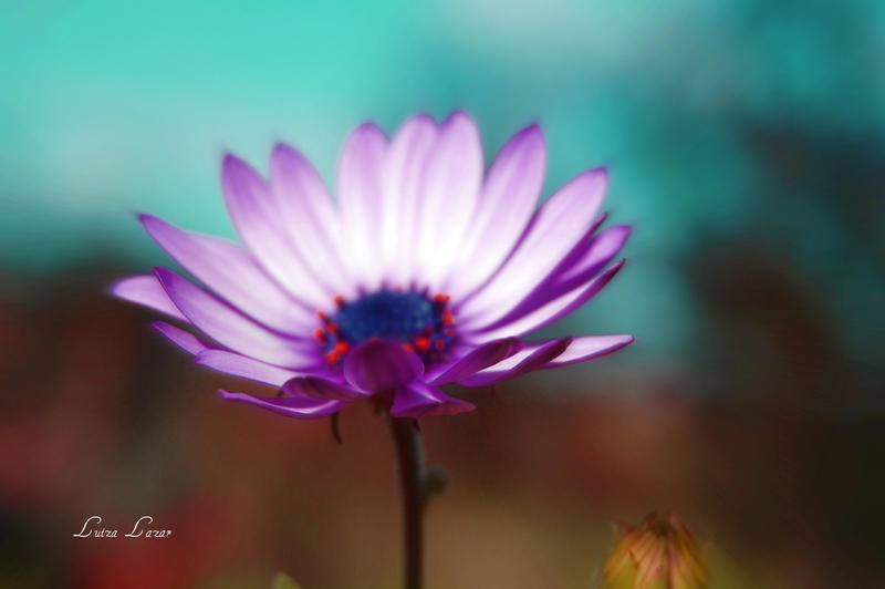
Image size
2804x1864px 470.89 KB
Make
NIKON CORPORATION
Model
NIKON D40
Shutter Speed
10/8000 second
Aperture
F/8.0
Focal Length
55 mm
ISO Speed
200
Date Taken
Mar 12, 2012, 5:34:49 PM
© 2012 - 2024 LuizaLazar
Comments27
Join the community to add your comment. Already a deviant? Log In
I reallt like the colors chosen for this photo.
The blue and the purple go great together, and the browns/reds at the bottom keep it looking natural.
Also, there is a partial blur in the back of the flower, and a clarity closer to the front.
This is something I would consider as a professional photo, because it's very sophisticated and mature.
But, it also conveys some sort of child-like happiness.
It's very simple, and maybe I'm just looking to far into it, but I really like it a lot.
Did you chose the colors? Because if not, then this is just a very happy coincidence.
Great Job <img src="s.deviantart.com/emoticons/b/b…" width="15" height="15" alt="